
Learning Resources
Lesson
Layout is the process of placing the graphic elements (images, illustrations, drawings, and copy [text]) in a presentation. It most often refers to document design. Documents usually have multiple pages. For electronic publishing, either to a screen (e.g., for the Internet) or to a printer, the basic considerations are the same. There is a message, there is an audience, and an effective layout is required to get the audience's attention and keep it.
The following issues should be kept in mind when laying out a page.
Simplicity
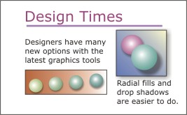
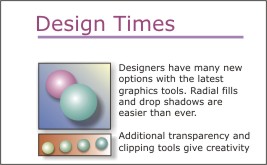
The most basic requirement is to keep the layout simple. Visual confusion is easy. Visual clarity requires a simple layout. Include only those elements essential to the message. Bring the reader's attention to the message as quickly as possible. Make the message clear and obvious. This can be done without being boring. Which of the following examples is the easiest to follow?
Figure Complicated Layout
Figure Simpler Layout
Consistency
Once a particular pattern has been established (e.g., typeface for headings/body text, size and colour for rules, position of images), use it consistently. This provides visual cues which help the reader to follow the flow of information.
Figure Visual Consistency
Tags and grids
Consistency in layout can be achieved by using tags and grids.
- Tags are electronic markers which specify typeface, font size, margins, character and line spacing, before and after paragraph spacing, and a number of other criteria. Many word processors and all desktop publishing tools employ tags. Some programs call them styles. Using a tag to format all items that are called headinglevel2, for example, ensures that they all look alike. HTML documents, like the one you are reading, use tags to format text and place images on the screen.
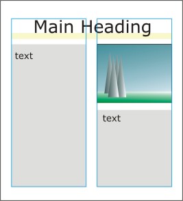
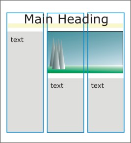
- Grids are standard practice in publishing. Two, three and four column grids are used. Electronic publishing for the internet is generally restricted to 2 or 3 columns. A grid allows consistency without being boring. Items may span one or more columns, but should normally fill the full width of columns (not go halfway).
- A computer screen grid is measured in pixels. PCs generally use monitors that have 96 pixels per inch.
- Printers measure in points and picas. There are 72 points in an inch, and 6 picas in an inch (12 points per pica).
- Desktop publishing tools can use points, millimetres, inches or several other measuring systems. Corel Draw uses all these and also pixels. Paint programs can use millimetres, inches or pixels. Use pixels if the work is to be used for the web.
Figure Two-column Grid (blue rectangles) for layout
Figure Three-column Grid for layout
Easy to find information
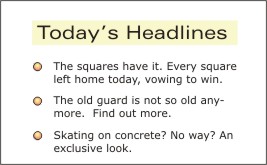
Make the message easy to find. Different approaches are possible, depending on the message and the audience. Information should be easy to find and follow. What works for a technical manual may not be very good for a story. Where possible, use visual cues and markers to draw attention to key locations and points in the information. Which example provides the most obvious message?
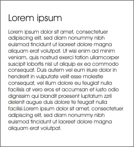
Figure Large Text Block
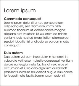
Figure Large Text Block with Headers
Whitespace or breathing room
Give the layout breathing room. Squeezing too much information into the available space is self defeating. Readers will get tired quickly. Allow lots of whitespace. Whitespace is not necessarily white if you are designing for video or a computer screen. An open, airy look is achieved through the methods discussed in the previous lesson on effective type usage. Examine the examples on this page and other pages to determine which ones make effective use of white space.
Design for the whole project
Design for the whole project. When developing the look for a layout, do it for the entire project. If it changes from page to page (or screen to screen) the reader will get confused. This is particularly true for parts of the project that will be viewed side by side as in two pages of a book, or scrolled continuously on a computer screen. Persistence of vision will also ensure that inconsistencies stand out in a video sequence. In a multimedia project, the user can be expected to move back and forth and across all parts of the product. Any differences would be very obvious and confusing. Are there examples in this lesson of layouts that could be used through the whole project? In other lessons?
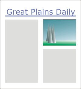
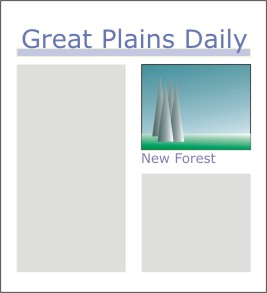
Use three visual (major) items
How many visual items? Three major visual items seem to work well. This can be the heading, an image, and the main text of a single story, or it can be the beginning of two different pieces of information with an image associated with one of them. It any event, three design features that compete for attention are effective, providing they imply a sequence or clearly distinguish relationships. 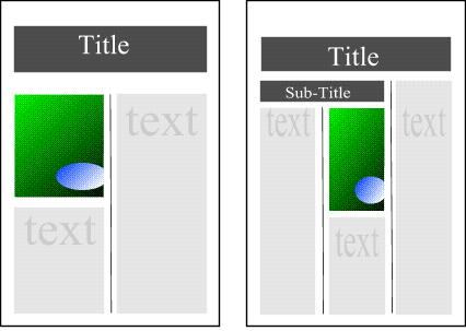
Figure Three Visual Focus Items
Integrating copy and images
Most graphics are composed of text (copy) and images. The advertising industry has discovered that certain basic principles are effective in conveying a message to the audience. It seems reasonable to assume that they will be effective in any situation. As with all previous principles, the designer has to use personal judgment about when to use them. They should be kept in mind when a strategy is being developed. Most of these principles make it easier for the reader to understand the message and to get to that level of understanding very quickly.
Copy vs Illustration/image
Copy has priority over illustration. This is a basic rule. A picture may be worth a thousand words, but if the message is simple then state it in simple terms. If there is text over an image, it must be clearly readable. It cannot blend into the image. What message is being given in each of the following images?
Figure Image without Copy
Figure Image with Copy


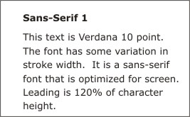
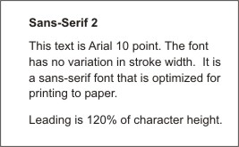
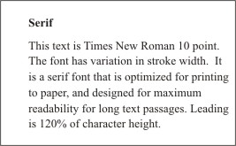
Serif vs Sans Serif
Copy is in serif type for all body text. Anywhere there is to be more that a line or two of text, use a serif style font. The exceptions are copy designed for the web, and print smaller than 8 point. If you want maximum readability, make it easier for the reader's eyes to follow the text. Use sans serif fonts only with deliberate planning. In the last example, look at the way the serifs create a horizontal line which draws your eyes across the text.
Figure Sans-serif Optimized for Screen
Figure Sans-serif Optimized for Print
Figure Serif Optimized for long printed passages
Captions
Use captions. Every photo/illustration must have a caption. A caption makes it easier for the reader to decide the relationship of the image to the text. Which of the following examples do you think makes the purpose of the image obvious?
Figure No Caption
Figure Caption to give Image a Context
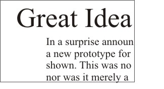
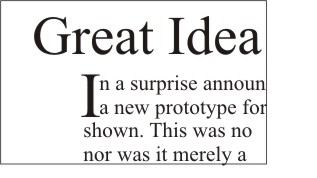
Drop Caps
Use drop caps (capitals). Start text with drop caps. This leads the eye into the text quickly from the headings. Headings are usually much larger type sizes than body text. A drop cap makes the transition much smoother. Note that in the example below, the drop cap goes from the ascender line on the first line of text to the descender line on the second line of text.
Figure Normal Font sizing
Figure Drop Caps
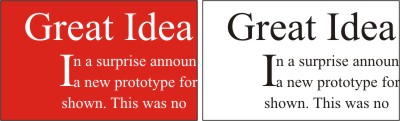
Use black type on white
Readability is the issue. As illustrated in the example below black text on a white background is always more readable than any other color combination. Sometimes it is unavoidable to use other combinations, especially when text is being superimposed over images. This probably applies more to graphics for video, computers and multimedia than to paper. Many professionally designed Web sites use black text on white backgrounds when more than a paragraph of text is involved.
Figure Black Text on White has more contrast (is more readable)
Activity
Assigned activities
This activity is best done using Corel Draw, or a Desktop Publishing program such as Microsoft Publisher. Instructions are for Corel Draw. Instructions are brief, but are accompanied by a series of video clips illustrating how to perform the steps.
Create a one page layout that incorporates a major heading, one or two subheadings, copy (text) and one or two images. Use a three column grid.
- Step 1. Set up a Corel Draw template
- Step 2. Layout a 2 column grid
- Step 3. Add page content and print the page
Reminder
- Create a suitable entry in the course portfolio to include your page layout.
Test Yourself
There is no self test for this lesson.