
Learning Resources
Lesson
A number of principles of visual design have been identified. These principles provide rules for arranging the elements of a graphic. By following these principles, one can create graphics which most people find pleasing to view.
Proportion
Proportion is the relative size of the various elements of the graphic. When they are correct, the graphic looks 'right'. The ancient Greeks derived the ratio for the golden mean (which is the ratio 1:1.618) They frequently used these proportions when constructing buildings and works of art. The golden mean continues to be used by designers, artists and scientists.
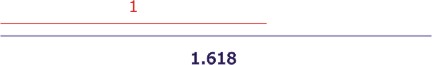
Figure The Golden Mean
The rectangle formed by using sides in the ratio of 1 to 1.618 is called the golden rectangle
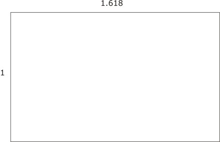
Figure The Golden Rectangle
For more information, see
The Golden Mean (Section) in Art, Architecture and Music
Balance
This refers to the relationship of the left and right sides of a graphic. If one is the mirror image of the other, it is formal balance (static) or symmetrical. Formal balance can also occur when both sides are different but have equal visual weight. If they are different and one side is dominant visually, it is informal balance (dynamic or asymmetrical).
Figure Informal Balance
Figure Formal Balance
Contrast
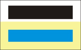
Contrast is the difference between the lightest and darkest parts of an image. Higher contrast has a bigger difference between the lightest and darkest colours. Black and White have the highest contrast.
Figure High Contrast
Figure Low Contrast
For additional information, look at Effective Colour Contrast
Contrast provides a strong attention-getting feature, but should normally be used in moderation. If used well, it can improve harmony (make things look better together). Contrast can be provided by colour, shape, position, type (text), or images.
Figure Contrast in Typeface and Colour

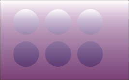
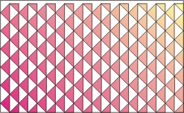
Pattern
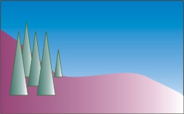
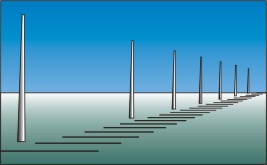
Pattern is the use of repeated elements for visual effect. Patterns can be 2-dimensional or 3-dimensional.
Figure Pattern as a Series of Repeated Elements (triangles)
Proximity
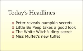
Proximity is the placing of elements of an image, or text, close together. Image composition often depends on the proximity of elements to convey ideas, concepts, feelings and so on. The visual relationship between various parts of a text layout can be strengthened or weakened by the use of proximity.

Figure Proximity
Alignment
Alignment is the relationship of elements in the graphic. They should be aligned to the right, to the left, centred, or using another strong visual organization. Try to avoid having some items aligned one way and some items aligned another way. Left aligned text is easier to read. Other alignments make it difficult to find your place at the beginning of each line.
Figure Left Alignment
Figure Centre Alignment
Figure Right Alignment
Repetition
This refers to consistency of some feature in the design. Use of a specific font and type size, a colour, bullets, or a specific graphic item can increase the strength of the design and give it a unified look.
Figure Bullets as Repetitive Element
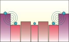
Rhythm
Rhythm is the feeling of movement in a graphic. It can be achieved by repeating a design element (line, shape, colour), by gradual changes in the elements as they are repeated, and by radiating them out from a central point.
Figure Rhythm
Whitespace
Whitespace is the amount of space in a graphic that is not filled by text or images. Although the term initially was used to refer to printed graphics and documents, it also applies to other graphics media. Whitespace is as important as any other part of the design. It provides eye relief and gives greater strength to the elements that are important to the design.
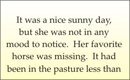
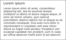
Figure Too Little Whitespace
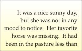
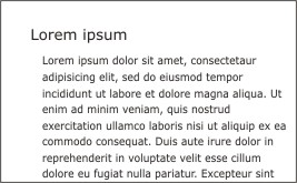
Figure More Effective use of Whitespace
Unity
Unity occurs when the elements of a graphic appear as if they belong together. The graphic has good balance, proportion, and harmony. There are several forms of unity.
- Thematic unity occurs when all the items are related to one another.
- Tonal unity occurs when all the items in the graphic have a consistent look and feel.
- Visual unity results when the items have a clear visual relationship and it is in keeping with the message of the graphic.
- Typographic unity occurs when the style of the typeface is consistent with the message of the graphic.
- Glossary of Printing and Graphic Terms at http://www.printindustry.com/glossary.htm
- Corel's Designer.com at http://www.designer.com
Activity
Assigned activities
Use the elements of visual design to create a series of images to illustrate each of the following principles of visual design. You may combine more than one principle in a single image.- proportion
- balance
- contrast
- pattern
- proximity
- alignment
- repetition
- rhythm
- whitespace.
Remember that whitespace is the term used to identify how much of the background is not covered with other graphic elements. On a computer it may not be white.
You may do this in one of the following ways
- As bitmap pictures, using Photo Paint or Painter Classic
- As structured drawings, using Corel Draw
- As freehand coloured drawings that you scan into the computer
Create a suitable entry in the course portfolio to include all your drawings. Provide a brief explanation of the effect you were trying to achieve in each image.