
Learning Resources
Lesson
As you have already learned, page layout is an application of visual design to the presentation of information. This lesson continues where you left off.
Anatomy of a Page
A typical page layout used in a newsletter, a brochure, newspaper, magazine or other publication has components that are used to organize and present the information. All of the terms below are illustrated in this pdf file. The pages are excerpted from a commercial publication, with nonsense text and graphics substituted for the original content. The document was created in Adobe PageMaker.
- margins (top, inside, outside, and bottom) are the spaces between the content columns and the edges of the paper. The document has top margin of 4 picas, inside margin 5 picas, outside margin 4 picas, and bottom margin 5 picas (6 points in a pica, 72 points in an inch).
- running head, running foot are text that occur at the top and bottom of each page. Notice that left and right pages are different. Notice also that both are set so that they can be easily read when flipping through the pages (they are aligned to the outside margins). The running foot is Humanst521 BT at 9 points, justified left on the verso page and right on the recto page. The running head is Humanst521 BT at 10 points, justified left on the verso page and right on the recto page.
- rules are horizontal (usually) lines with the thickness specified in points, used to highlight, to organize and draw the readers eye to specific locations
- headline is the title of the document. The document headline is Humanist521 BT at 30 point bold, centred.
- overline (also kicker, eyebrow) is a short piece of text over the headline to give more specific info about the type of article. It is Humanist521 BT at 9 point bold, centred.
- deck (or tag line) is placed below the headline to give more info about the article. It is Humanist521 BT at 18 point bold, centred.
- byline is the authors name (for example, by john dough). It is Humanist521 BT at 10 point bold, centred.
- subhead is a smaller heading that gives information about a part of the article. It is Humanist521 BT at 18 point bold, centred. It has a column width 1 point rule located 2 picas above the baseline (the bottom of regular characters like x)
- column is a vertical space on the page that holds a block of content (text, graphics). The document has 2 columns. The inside column holds body text for the main article and is 24 picas 7 points wide. The outside one holds sidebars, breakouts, and graphics, and is 15 picas 11 points wide.
- body text is the main text in the article. It is Garamond 9.5 point for the main document, justified left.
- sidebar is a special block of text that is a secondary story related to the main article. Sidebar body text is Garamond 9 point, justified left.
- breakout (or pull quote) is a sentence or part of a sentence 'pulled' from the body text and placed separately on the page. It is usually larger type and often uses rules to separate it from other text. Breakouts are Garamond 10 point, bold and italic, justified left. It has a column wide, 1 point, top rule located 1 pica above the baseline, and a column wide, 1 point, bottom rule located 1 pica, 6 points below the baseline
- callout is a short piece of text labelling something in a graphic. It is part of the graphic, but usually heading fonts from the document are used.
- leader is a line with arrowhead joining a callout to the item in the graphic that it describes.
- caption (or label) is a piece of text that gives information about a graphic or picture. It is frequently started with the same word such as Figure, Picture, Table, ...) and numbered. Captions are Humanist521 BT at 9 points, bold, justified left.
- continued line is used to indicate that text is continued on another page (includes page number) or continued from another page (includes page number). It is necessary in documents that have multiple articles that are not on sequential pages. It is the same as sidebar text, but italic.
- printing rule is used to draw an outline, or box, around a block of text. In this example, the box has rounded corners.
- screen (or tone) is a background colour used to fill an area on the page. In this example it fills the box and is used as a background to the text. Screen refers to the method of reproduction of colour blocks on printing presses. The ink is printed through a screen. It is usually designated as a percentage of full colour density, for example 20%, 60% and so on. In the example, the screen or tone is 10% yellow.
- alley is the spacing between columns. The example uses alleys of 1 point, 6 picas width
- gutter referees to the space between two pages in a double-sided document
- folio is the page number. It frequently has additional info such as volume, chapter, and page number
- recto means right hand page (considered to be the front page). It is also an odd numbered page since all documents start with page 1 being a right hand page.
- verso means the left hand page (or reverse of the front page)
The following terms are illustrated in this Adobe PageMaker generated pdf file.
- dropped cap is a beginning capital letter in a paragraph that is made larger and its baseline is dropped below the text baseline by three lines of text.
- raised cap is a beginning capital letter in a paragraph that is made larger, but the baseline for the capital letter is kept on the same baseline as the line of text.
- dingbat is a graphic device used to signify a special status at a point in text. Bullets are the most common dingbats. Another use is to denote the end of an article.
- wraparound text is text that follows the outline of a graphic
The Grid
Grids are the basic building block of all professional page design. They provide a structure while giving a great deal of flexibility. Grids are used not only for vertical alignment, but also for horizontal alignment. The PageMaker document referenced in the first pdf file uses 5-column grids
- the grid on an empty 2 page spread
- the grid on page 2 and 3 of the document
In its simplest form, a grid is simply dividing the page into a number of evenly spaced vertical and horizontal blocks. The basic grid gives 2 or 3 columns. Grids have space between the vertical blocks to allow for alleys. Here are a number of vertical grids
- two column
- three column
You may have noticed that as the number of columns defined by the grids increase, the more flexibility you have in arranging your content. You may also have noticed that the vertical arrangement of grids stays fixed for the whole document. The horizontal grid lines are more flexible, and are usually added and removed as needed. The are used to give visual alignment of content across a single page, or across two pages.
Additional Information on Grids
- http://www.cultsock.ndirect.co.uk/MUHome/cshtml/index.html
- Grids: Organizing your layout
- Layout Grids - On the Grid
Page Mock-up
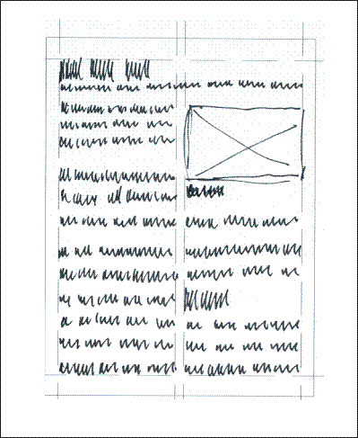
One of the techniques for designing a page layout is to create mock-ups. These are pencil or pen sketches of the pages. It is usually more efficient to create the grid first and duplicate a number of copies.
The purpose of the mock-up is to design the visual look of the page, so rather than try to print large quantities of text by hand, a process called greeking is used. This is the use of scribbled lines representing text. The scribbled text is usually made as close to the actual text size as you cam make it. Boxes with an X across them represent images. The technique provides a fast, effective way to design document layouts.
Figure Page Layout with Greeking
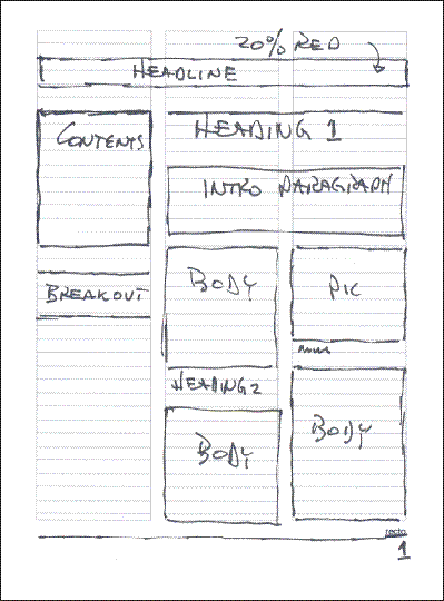
A simpler way to do the same thing is to use boxes to represent text as well as images, as in the following example
Figure Page Layout with Blocks
Typography Decisions
Page design requires typography decisions. The standard is to use a sans-serif for the headline, headings and captions, and use a serif font for everything else. This does work well. Other variations can be used quite effectively. This web page uses the same font for everything. Visual interest is maintained by careful use of size, bold, and colour for headings and captions. Sans-serif fonts for body text work well for the web, and for smaller than 9 point in print.
The sequence for making typography decisions should be similar to the following
- use one sans-serif font (Arial, Futura, or Franklin Gothic Medium for example) for headline, headings and captions (Verdana is designed as a screen font and does not work well in print)
- use one serif font (times, times roman, garamond, or bookman old style, for example) for everything else.
- set the font size for body text. Depending on the font chosen, this can be anywhere from 10 point to 12 point.
- determine the number of levels of headings (headline, heading 1, heading 2, for example)
- set the size for the smallest heading. It should be at least as big as the body size. Don't go by point size, as different fonts are different physical sizes. Create examples and put them side by side to compare. Also determine the position relative the spacing to text above the heading and below the heading
- set the size and positions for other headings, going up in size. Make the differences enough to be obvious. Other techniques include using bold, colour, or placing a rule above and/or below the heading. Do not use underline in the software program!!!
- set the size and position for other items, such as caption, that use sans-serif fonts
- identify all other uses of serif text, such as breakouts, and set the font size as well as use of bold, italics or other decorations.
The decisions resulting from this process are recorded in a document called a style sheet.
Typical Style Sheet Settings
- Headline, Heading 1-4, Captions are Arial
- Headline 36 point, bold, paragraph 200% spacing after, start new page before
- Heading 1 24 point bold, paragraph spacing 200% before, 150% after
- Heading 2 18 point bold, paragraph spacing 200% before, 150% after
- Heading 3 14 point bold, paragraph spacing 150% before, 120% after
- Heading 2 12 point bold, paragraph spacing 120% before, 100% after
- Caption 10 point, paragraph 100% spacing before, 250% spacing after
- Body, breakouts and all other content are Garamond
- Body 10.4 point, line spacing 120%, paragraph spacing 0% before, 180% after
- Breakout 11 point, italic, same line, paragraph spacing as body, column width 1 point rule above and below
- Contents 9 point, same spacing as body
Additional Information on Typographic Decisions
Additional Information on Page Layouts
- Sample PageMaker newsletter layouts. This is a screenshot from the PageMaker template screen.
Activity
Assigned activities
The purpose of this activity is to develop capability with planning a page layout. There are two resource pages you need to print. Both are .pdf files. Both have two pages, Recto (right or odd numbered page) and Verso (left, or even numbered page) You may need to print several copies of each to experiment with.
Complete each of the following
- Using either of the page planning techniques shown in the lesson, sketch 2 or 3 different two-column page layouts. Scan the layouts at 100 dpi and save them as jpgs or gifs
- Using either of the page planning techniques shown in the lesson, sketch 2 or 3 different three-column page layouts. Scan the layouts at 100 dpi and save them as jpgs or gifs
- create an entry in your portfolio to hold all the scans.
- write a stylesheet specifying fonts and sizes for each of the layouts, and include in your portfolio
- publish the portfolio to your course portfolio web
Test Yourself
There is no self test for this lesson.