
Learning Resources
Lesson
Type is the set of letter shapes, or graphic symbols, that make up an alphabet.
A typeface is a particular alphabet design. Many different typefaces have been developed by changing the shapes of letters. A typeface can have different styles such as light, heavy, bold, and italic. In the computer world, a single style of a typeface (e.g., Antiqua Bold) is known as a font.
Alphabets in the Western world usually have two distinct cases of letters, upper and lower. Capital letters are often called upper case and small letters are called lower case. These terms probably originated during the time of movable type when lead type was stored in cases. The capitals were in the upper part of the cabinet, and the smaller letters in the lower part.
There are six general classifications of typefaces, ranging from serif to novelty. All fonts fit into one of these six categories. In addition there are a variety of attributes. Knowledge of these classifications and attributes is essential for choosing an effective typeface or font for a particular purpose.
Type Attributes
Each character, or letter, in a typeface can have a variety of attributes as demonstrated by the following diagram. Each of the terms is described in the section following the diagram.
Figure Type Attributes
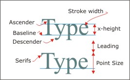
Explanation of Terms:
- Baseline. This is not an attribute. It is the horizontal line that all characters rest on. Only descenders extend below the line.
- X-height. This is the height of standard lowercase characters (usually the letter x).
- Descender. This is the part of the character below the baseline. The distance is set by the descender line. Different typefaces use different length descenders.
- Ascender. The part of the character that extends above a line at the x-height. The distance that ascenders extend above the x-height is set by the ascender line. This also varies from one typeface to another. Often the ascender height is not the same as the height of capital letters.
- Stroke width. This is the thickness of the strokes that make up a character. It often varies along the shape of the character as in these examples. There are a variety of widths available for many typefaces. These include hairline, thin, light, book, regular, medium, demibold, bold, heavy, and ultra.
- Point size. This is the total height of the character set measured from ascender to descender lines.
- Leading. Pronounced 'ledding'. This is the spacing between lines of text. The name comes from the lead type used in movable type printing presses. Additional spacing between lines of type was created by inserting a thin strip of lead between each line.
- Kerning. This is the spacing between pairs of characters. Kerning is usually adjusted so that the area between each pair of characters is the same
- Serif. A short line added to the ends of characters.
Type Classification
All the examples below are at 16 point.
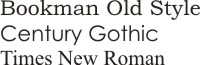
Serif
A serif is a short line or shape added to end of characters to improve the readability of words and sentences. Serif type has these elements as thin strokes and are usually called roman letters. This is the most legible form of text and is used extensively in books and other publications. It works very well in headlines.
Figure Serif Fonts
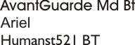
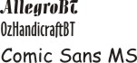
Sans serif
Type without serifs. This is a very clean design. Some examples are very legible. It is often a good choice for headlines and special emphasis.
Figure Sans serif Fonts
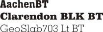
Square serif
This is similar to serif, but the serifs are blocks. This form is more difficult to read and should be used sparingly for special purposes
Figure Square serif Fonts
Script
Script is a type that is similar to handwriting. It is often used in invitations, greetings and announcements. It is never used in all capitals.
Figure Script Fonts
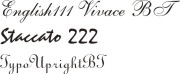
Old English
Sometimes called Text. This is a very ornate style with elaborate decorations. It was used by scribes during the middle ages. It is mainly used for special purposes.
Figure Old English Fonts
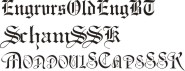
Novelty
Any typeface that cannot fit the previous 5 is assigned to this category. Often a typeface is designed for a particular purpose, such as company names, special events, or to portray a 'feeling'.
Figure Novelty Fonts
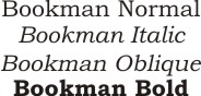
Type Styles
Many typefaces are available in a variety of styles. For example, normal is vertical, italic is redesigned to be thinner and tilted slightly to the right, and oblique is tilted without being redesigned.
Figure Typeface Styles
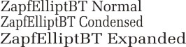
Characters can also be normal, condensed (squeezed together across the width), or expanded (stretched across the width). This is often done with computer software.
Figure Character modifications through software
For an excellent, but slightly different presentation on type classification go to http://www.redsun.com/type/classification/
Typeface makes a significant difference to the effectiveness of type in a. It can appear heavy or light, inviting or forbidding. Several considerations must be accommodated when choosing an appropriate face.
Type effect
This is the overall look of the type. It can enhance or detract. Which of the following do you think goes better with the message?
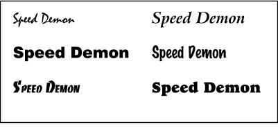
Figure Type Effect
Type Texture
The texture of type is created by three factors. The x-height controls the body height of the characters and affects amount of whitespace between the lines of text. Smaller x-height makes a page of text seem lighter. Stroke weight affects the appearance of heaviness of the characters. Some typefaces have variable widths and look very delicate, while others are thick and look very heavy. Leading refers to the spacing between lines of text. More leading gives an open, airy look and less leading gives it a heavy, dark look.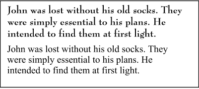
Figure Type Texture - X-height
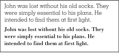
Figure Type Texture - Stroke weight
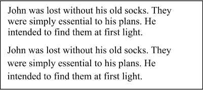
Figure Type Texture - Leading
Serif versus Sans Serif
A good rule of thumb is to use serif fonts for body text. It can also be used for headings and most other applications. Sans serif fonts are quite effective for headlines, short attention-getting messages, and larger type sizes used for contrast. If the type is to be very small, sans serif is most effective.
Justification
This refers to the alignment of the left and right edges of a column of text. There are four possibilities
- left justified
- right justified
- centered
- full justification.
Left justified is always easiest to read because the whitespace between characters and words is constant and the left margin is visually easy to find. 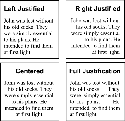
Figure Justification
Capital Letters
Sometimes all capitals are used for emphasis. This is tricky to do since it decreases the readability of the text. Text is read by observing the outlines of the words. Use of all capitals means that all words will have the same shape - rectangular. It is usually best to avoid all caps except for very special occasions, and then only for one or two words.
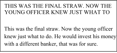
Figure All Caps versus Regular text
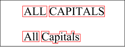
Figure Shape of Words and Effect on Legibility
Emphasis and Contrast
Emphasis and contrast can be achieved with type by using different typefaces and/or sizes. In addition use bolding and italics or other effects such as colour. Underlining is never a good thing. If a line under text is desired (and never in the body of a document) use a rule. A rule is a separate line. Its thickness and length can be controlled. it is always placed below the descenders. 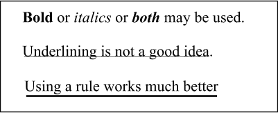
Figure Emphasis in text
Additional information about typography can be found at
- A museum of typography at http://abc.planet-typography.com/index.html
- Info on True Type fonts at http://www.truetype-typography.com/
- All good things Typography at http://www.redsun.com/type/
- Typography, Layout, and Graphic Design at http://condor.depaul.edu/~dsimpson/pers/typography.html
Activity
Assigned activities
Typography has been an issue since people began recording things on stone, clay, parchment and paper. Type has a significant effect on the look of a piece of text. Each of the following activities will give you an opportunity to see some of these effects
- The text below is a piece of Latin 'nonsense' text that has been in use continuously since about 1500 by printers. It is chosen because you can see the effects of font and layout changes without having to read the content. Using it, make a couple of copies for each type style, applying a different font to each one. You can work in Corel Draw, Word, or FrontPage.
Lorem ipsum dolor sit amet, consectetuer adipiscing elit, sed diam nonummy nibh euismod tincidunt ut laoreet dolore magna aliquam erat volutpat. Ut wisi enim ad minim veniam, quis nostrud exerci tation ullamcorper suscipit lobortis nisl ut aliquip ex ea commodo consequat. Duis autem vel eum iriure dolor in hendrerit in vulputate velit esse molestie consequat, vel illum dolore eu feugiat nulla facilisis at vero eros et accumsan et iusto odio dignissim qui blandit praesent luptatum zzril delenit augue duis dolore te feugait nulla facilisi
- Create a short phrase related to some event or idea. Make 10 copies of it and use a different font for each one. Try to find a font that visually gives the same feeling that the phrase gives
Create a suitable entry in the course portfolio to include all your font effects. Provide a brief explanation of the effect you were trying to achieve in each.