
Learning Resources
Lesson
Graphics are composed of the basic elements line, shape, form, texture and colour. These may appear as defined, or physical, features. But sometimes a line, shape or form may be implied by the arrangement of the elements in a graphic.
Line
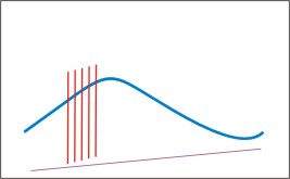
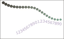
A line is the most fundamental element of a graphic. Lines can exist alone or be part of a collection. The variables of line are: size, shape, position, direction, number, interval and density. Points create lines, lines create shapes or planes and volume.
Figure Defined Lines
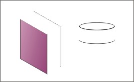
Figure Implied Lines
Shape.
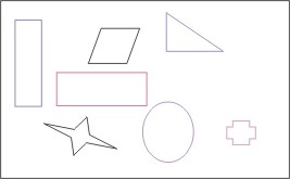
Shapes are areas enclosed by lines or areas defined as a result of a collection of lines. Shapes may also be implied by the placement of other shapes.
Figure Defined Shapes
Figure Implied Shapes

Form
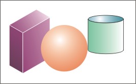
Forms are 3-dimensional or can have the appearance of being 3-dimensional. The object will have height, width and depth.
Figure Defined Forms
Figure Implied Forms
Texture
Texture refers to the visual look or feel of a surface. It is, or implies, a 3-dimensional feature. For printed graphics, texture can be a tactile element as well as a visual one. Graphics on a wallpaper, for example, can be embossed or 'raised' on the surface so that the texture can be felt. This is not possible with video and computer graphics, so the texture has to be visual and has to imply a physical texture. Texture can, for example, be rough, smooth, soft, or hard, or can appear to be warm or cold.
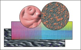
Figure Textures
Colour
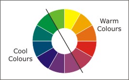
Colour affects the attention given to parts of a graphic. Some colours appear to stand out, while others appear to recede. Colour affects the overall appearance of a graphic as well as the detail that the viewer sees.
Some groups of colours work together very well and are considered harmonious, others do not and are in contrast to one another. Colour affects the appearance of size and weight, and often affects a person's feelings. Many colours are associated with specific events or products.
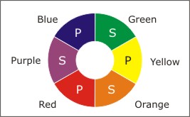
Figure Basic Colour Wheel (P is primary, S is secondary colour)
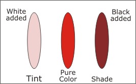
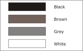
Colour tone can be made darker or lighter by adding black or white, respectively.
Figure Tint and Shade of a pure colour
Figure Cool and Warm Colours
Figure Neutral Colours
Colour is employed differently in print and on computer monitors.
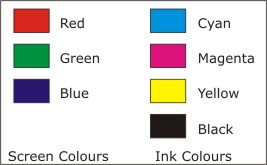
Colours on a video screen are created differently than those on physical materials. Video images are light sources. The primary colours used to create them are red, green and blue (RGB). Mixing them in equal proportions gives white. An absence of all three gives black
Printed images are viewed from light reflected from the image. The colours used to create a printed image are cyan, magenta, yellow, and black (CMYK). Cyan, magenta and yellow are the complimentary colours for red, green and blue. Theoretically, mixing the three colours gives black. Black ink is required in printing because mixing the three inks does not give a true black. When creating computer based graphics that are to be printed this conversion process has to be considered.
Figure Differences in Screen Colour Model and Printer Ink Colour Model
Activity
Assigned activities
A working knowledge of the elements of visual design will be required to build your own graphics. The following activity will give you practice identifying these elements.- Examine each of the images below and
- identify the elements of visual design
- identify principals used to convey or enhance the message
- Using a paint program, create at least three new images to illustrate your understanding of each of the following: (more than one may be employed in an image)
- lines including implied lines
- shapes including implied shapes
- forms including implied forms
- texture. Try to create a variety of textures. Use the features of the paint program to manipulate texture.
- color. Experiment with changing shade and tone. Observe the effects of different colored text on colored backgrounds. Note which combinations are legible. The issue of text color will be addressed in the next lesson.
Click on each example to view a larger image.

|

|

|

|
|

|
Create a suitable entry in the course portfolio to include all your drawings. Provide a brief explanation of the effect you were trying to achieve in each image.
Test Yourself
There is no self test for this lesson.